


***UPDATED***
I think we have a winner with design B (or #2)
That was the one I was leaning towards as well. I might see if I can make the font a tad thicker.
THANKS to everyone for your feedback! My readers ROCK!
I think we have a winner with design B (or #2)
That was the one I was leaning towards as well. I might see if I can make the font a tad thicker.
THANKS to everyone for your feedback! My readers ROCK!
 NEW: Elephant Juice Designs & Photography Blog
My business is *blooming* and I am looking forward to a busy Fall season full of amazing portrait sessions. Before all of that begins, I want to announce my new photography blog! As you can see, I'm revamping my business branding. The possibilities for the future of Elephant Juice Designs are endless. Go check out the new digs, read more about it ,and let me know what you think! Don't forget to bookmark me!
I'm still keeping this blog, just as it is {but I might change the name, as to not get it confused with my business blog and sites}. Only it will now go back to being mainly about me and my family...the reason I started it! It is a digital scrapbook of our lives. Although I love to showcase my photography on it, I'm ready to get back to my random "favorite things" posts, {get REAL} challenges, and stories about my baby boy!!
Any ideas for a new name for this blog?!?
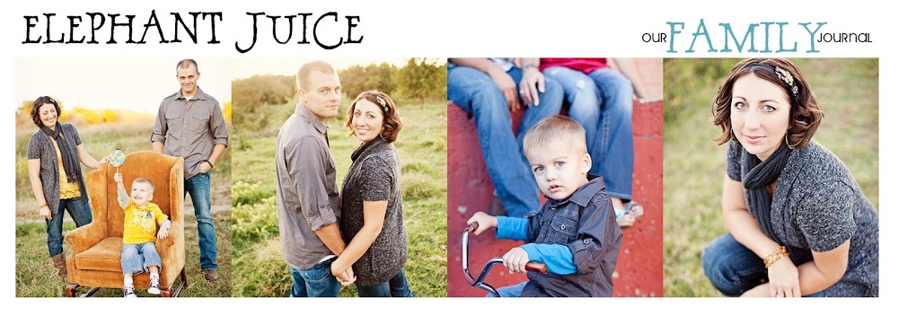
I think I'm pretty happy with the new colors and logo design...but I'm still open to suggestions and feedback. I'm not sure about the font though. Please give me your vote!
Design A:

****
Design B:

I'm still keeping this blog, just as it is {but I might change the name, as to not get it confused with my business blog and sites}. Only it will now go back to being mainly about me and my family...the reason I started it! It is a digital scrapbook of our lives. Although I love to showcase my photography on it, I'm ready to get back to my random "favorite things" posts, {get REAL} challenges, and stories about my baby boy!!
Any ideas for a new name for this blog?!?
I think I'm pretty happy with the new colors and logo design...but I'm still open to suggestions and feedback. I'm not sure about the font though. Please give me your vote!
Design A:
****
Design B:


Hi Laura...so excited for all your new adventures in photography...I like design A...the "elephant juice" stands out more...
ReplyDeleteYou're so talented in so many ways, I'm sure you'll be fantastic in all you do...
I enjoy reading your blog...feel like I know you...maybe someday I'll meet you and little Barrett!!! :)
I like the second one, as far as font goes. How 'bout "3 little elephants" or something like that for your blog name?
ReplyDeleteI like the font in the second one...it's more fluid and creative...looks more like it's "written" and not a font off the computer. I do think that the first design makes the "elephant juice" pop. Perhaps you can use design 2 and increase the color intensity of the lettering or thicken it a bit. I linked to you from coffeeshop (photoshop blog) where you just won her contest-lucky you!!!! Just wanted to let you know about my learning activity blog for you to share these activities with Barrett... http://SMMARTideas.blogspot.com
ReplyDeleteTake care,
Lisa
I like the 2nd design...but the boldness in the elephant juice font on the first design.
ReplyDeleteCongrats on your booming business! Loved all of Barrett's pics at the golf course...great family pic too!
I like the second one better. It's a more unique font and I'm not a big bold font person. Love the logo!
ReplyDeleteI think I like the 2nd one better. It looks more like your style. Your possiblilities are endless, you are a talented girl and just as sweet as can be. Love ya!
ReplyDeleteI'm a big fan of the 2nd font. The PH in elephant are easier to read. That said, the first design has a brighter/darker font and is a little easier to read. Can you make the 2nd one bold or add a drop shadow? Just a thought. :) So glad to hear your business is going so well! I'm a huge fan of your designs. Saw Brandon's wedding invitation and fan/program at mom and dad's and loved them both. You are so talented!!!
ReplyDeletei really like the second one :)
ReplyDelete